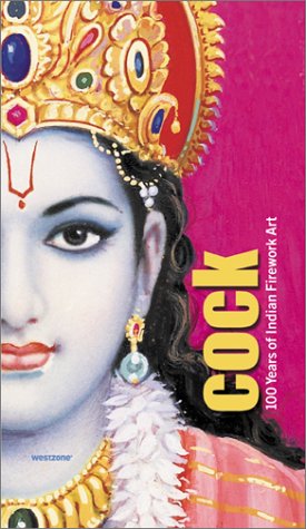
 "in india images are loaded, they explode with meaning... they have great potential," writes peter nagy, former director of new york's nature morte gallery, in his introduction to the provacatively titled ‘cock’ - a book about indian firework art. compiled by gavin aldred on his trip to india, it is a stunning and rather pointless book that was released a few years ago.
for those of us who have grown up here, the almost violent colours, the mad and sometimes crude graphics, and the extreme typography that you would find in firework/calendar/street/billboard art is pretty ho-hum. yet, when you see a collection of images together, it’s like an explosion in the brain…too much, too soon.
printed on boards in concertina form and packed in original fireworks boxes, this book (like a reviewer claims) celebrates a graphic language where understatement is suicidal, excess equals success, and sheer spectacle is everything.
it’s difficult to find a copy here, so, on your trip abroad you could pick one up. or simply order it on amazon.

No comments:
Post a Comment